Aurum
Aurum is a forward-thinking digital banking brand aiming to redefine the way people experience everyday finance. With a sleek visual identity and intuitive product ecosystem, Aurum combines functionality and sophistication, offering a user-friendly alternative to traditional banking. Our goal was to create a brand that feels as elegant as a luxury product and as seamless as your favourite app.


The Challenge
In a crowded fintech market, standing out means more than just convenience — it requires a clear identity, trust, and emotional connection. Aurum approached us to build a holistic brand experience for a modern banking solution, covering everything from the debit card design to the mobile app interface. The challenge? Marry security and simplicity with elegance and lifestyle appeal.


Our Approach
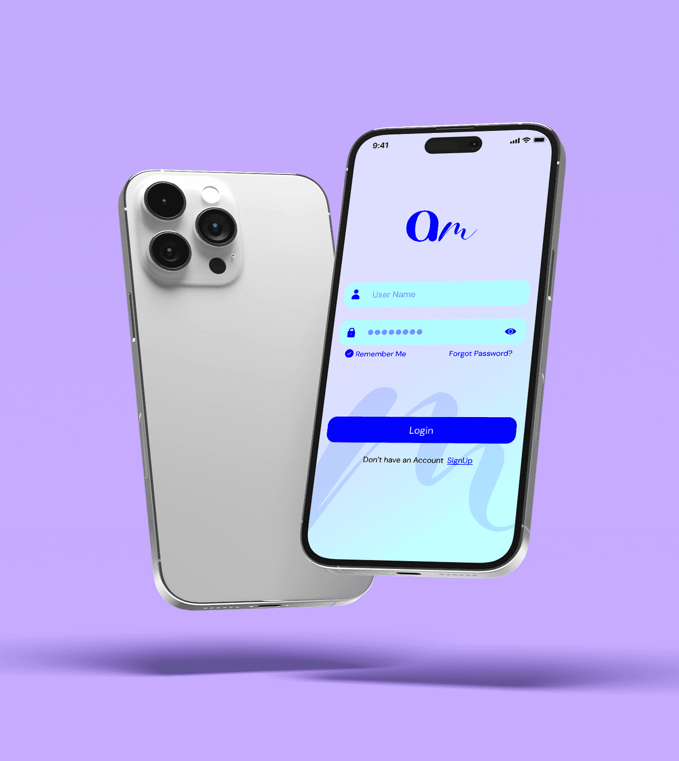
We rooted the visual identity in the concept of modern fluidity — effortless movement, financial freedom, and stylish minimalism. The wordmark combines clean geometry with a soft script-style ‘m’, symbolising the blend of trust and warmth. A calming yet confident colour palette — primarily gradients of electric blue and soft violet — gave the brand a bold but polished tone. Every touchpoint was crafted to feel premium, accessible and intuitive.

Development
Our work spanned multiple touchpoints:
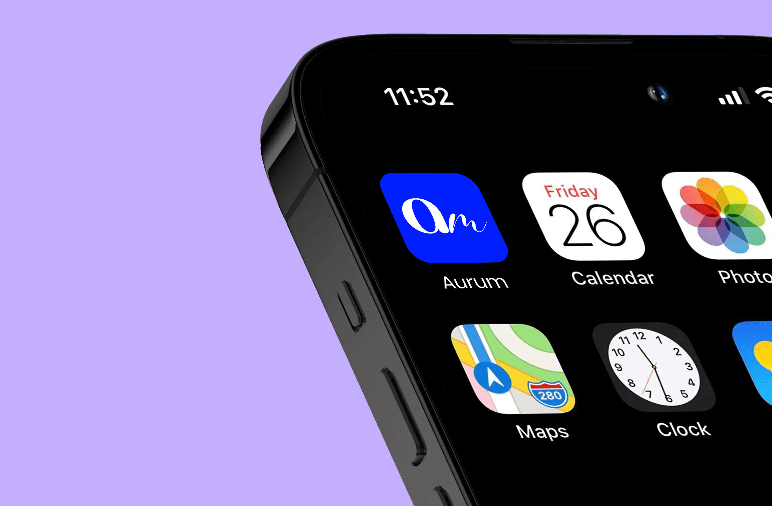
Logo & Brand Assets: A distinct wordmark and icon system that scale from app icon to billboard.
Card Design: A contactless-ready debit card with vibrant colour gradients and subtle gloss overlays.
App Interface: A clean, intuitive mobile banking experience — from login screens to account dashboards — designed for effortless daily use.
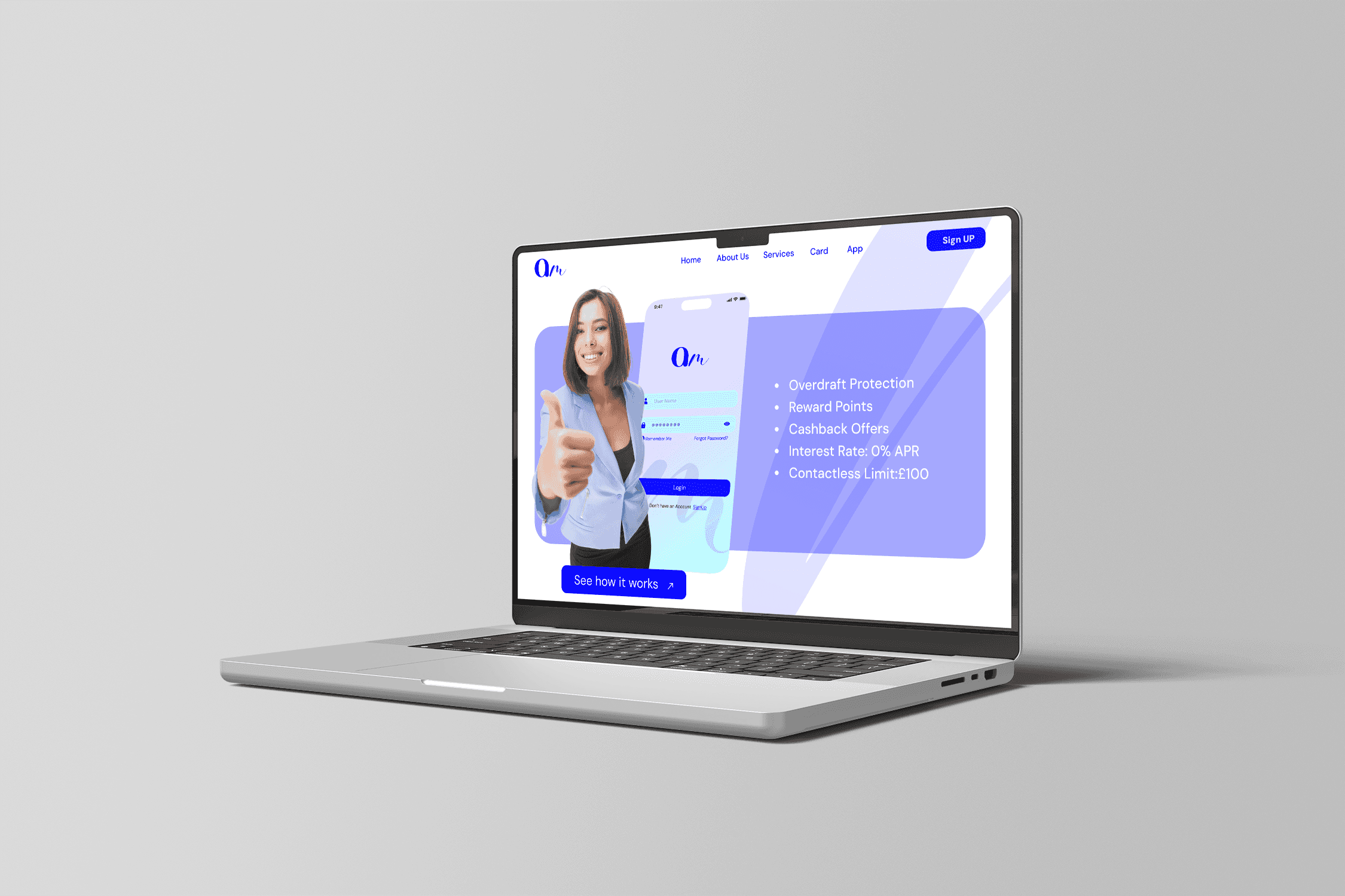
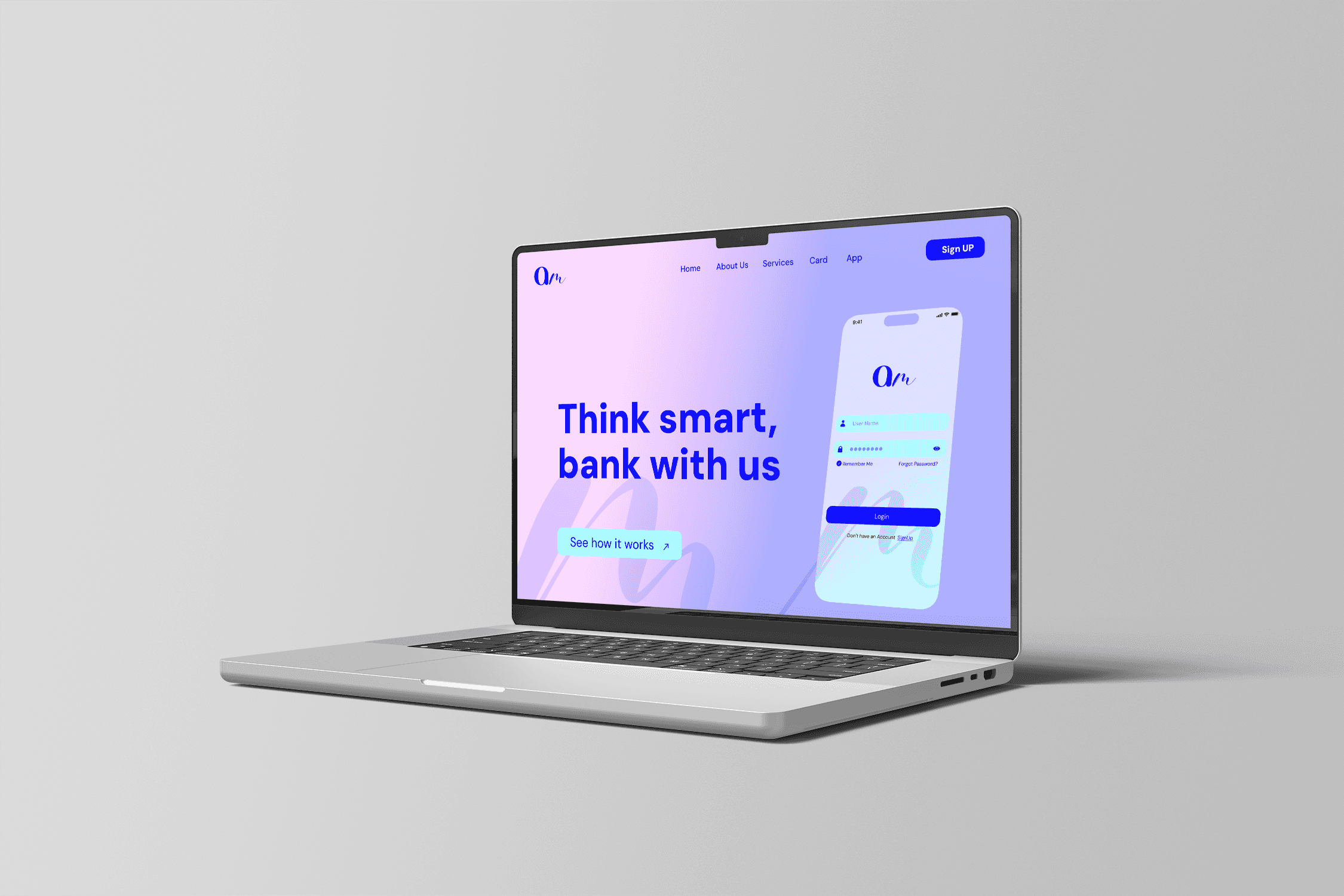
Website: A responsive and friendly website showcasing services, features, and onboarding with clarity and warmth.
Marketing Collateral & Merch: Print ads, social visuals, and branded merchandise such as T-shirts and presentation templates to round out the brand ecosystem.
Outcome
Aurum launched with a confident, modern presence — visually distinctive while radiating trust. The branding helped position Aurum as more than just a financial service; it became a lifestyle utility. Feedback has praised its intuitive app experience and standout card design, successfully connecting with its target market: digital-savvy users seeking elegance and ease in their financial lives.