Brew & Co.
Brew & Co. was envisioned as a modern coffee brand that blends craftsmanship with joy. Our goal was to create a warm, memorable identity that captures the sensory experience of freshly brewed coffee, while positioning the brand as approachable, authentic, and premium.


The Challenge
In an increasingly saturated market, Brew & Co. needed a distinct identity that could stand out on shelves, resonate emotionally with coffee lovers, and reflect the artisanal care behind every product. We also needed to ensure visual consistency across a diverse range of touchpoints, from café signage to retail packaging.


Our Approach
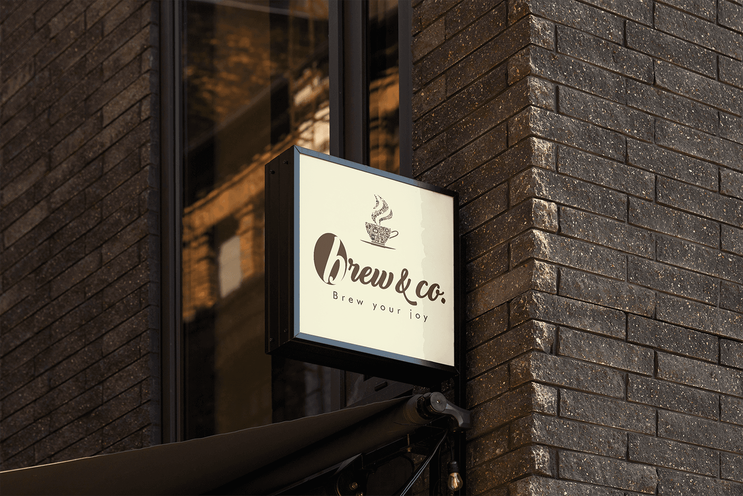
We immersed ourselves in coffee culture, studying consumer rituals, trends, and expectations. Drawing inspiration from Brew & Co.'s ethos of "Brew your joy," we crafted a visual language centred around rich, earthy tones and organic shapes. The brand mark — a stylised steaming cup with coffee elements — was developed to symbolise warmth, passion, and community.


Development
We created a hand-drawn style logo with flowing typography that feels inviting and human. The packaging design uses a layering of natural, coffee-inspired shades to evoke flavour and freshness. Custom patterns and illustrations add vibrancy while maintaining a handcrafted feel. From takeaway cups and tote bags to marketing collaterals and digital assets, every element was designed to consistently express the brand's core essence: simple pleasures brewed to perfection.
Outcome
Brew & Co. now carries a brand identity that feels authentic, joyful, and recognisable. The cohesive visual system helps the brand build trust with customers, enhances shelf appeal, and sets a strong foundation for future growth — from boutique cafes to packaged goods.