Crisp Oats
Crisp Oats is a bold and vibrant snack brand bringing the perfect balance of health and flavour to modern consumers. Built around the promise of guilt-free indulgence, Crisp Oats reimagines everyday snacking with crunchy oat-based treats infused with premium nuts and zero added sugar. With a strong presence both online and offline, the brand speaks directly to health-conscious snackers who won’t compromise on taste or aesthetics.


The Challenge
In a market flooded with sugary snacks and bland health bars, Crisp Oats needed to carve a distinct identity—one that could confidently stand in the healthy aisle but still appeal to impulse snack buyers. The brand had to capture attention on shelves, stand out on social media, and most importantly, earn trust through design that reflected its nutritional integrity.


Our Approach
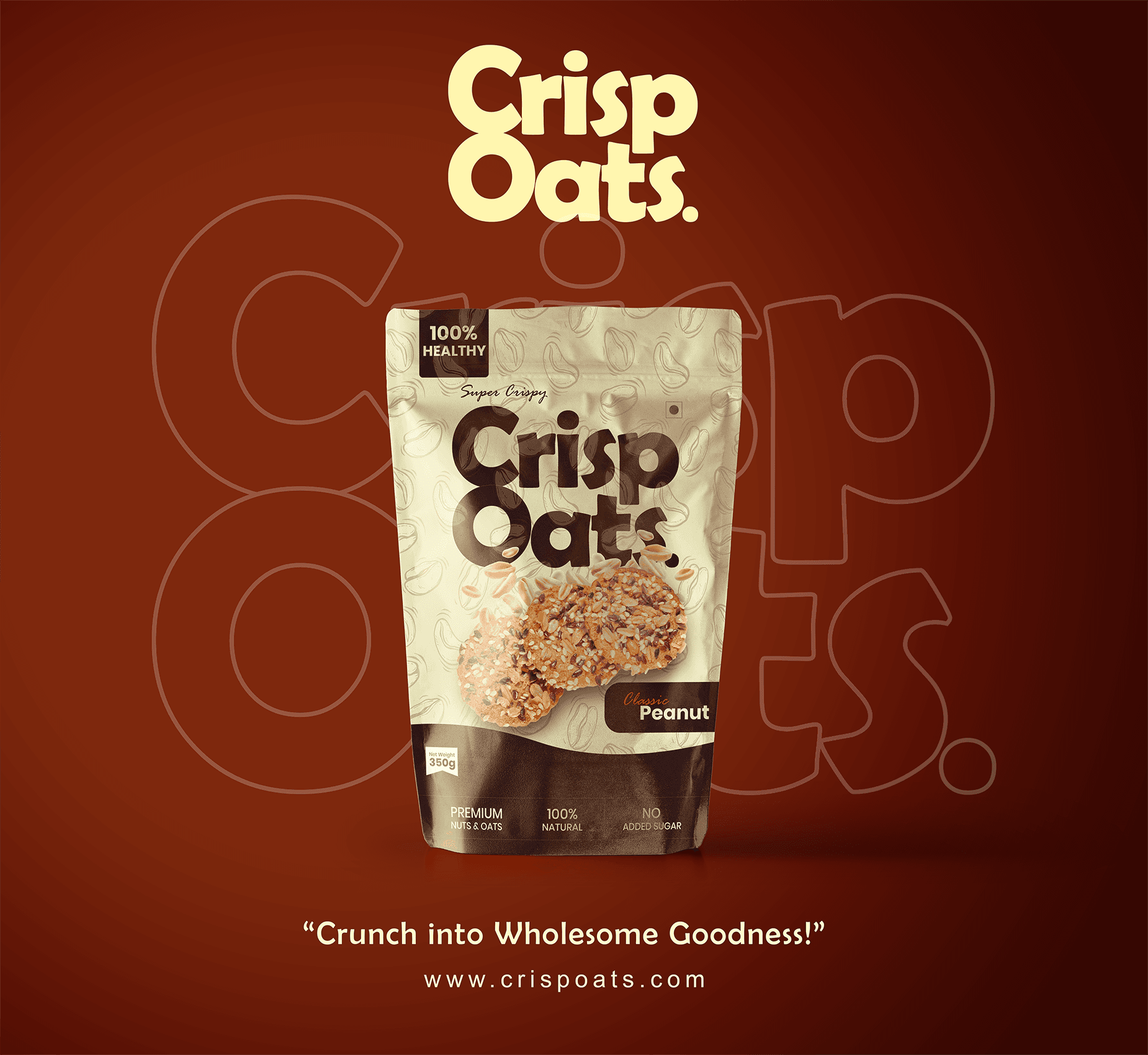
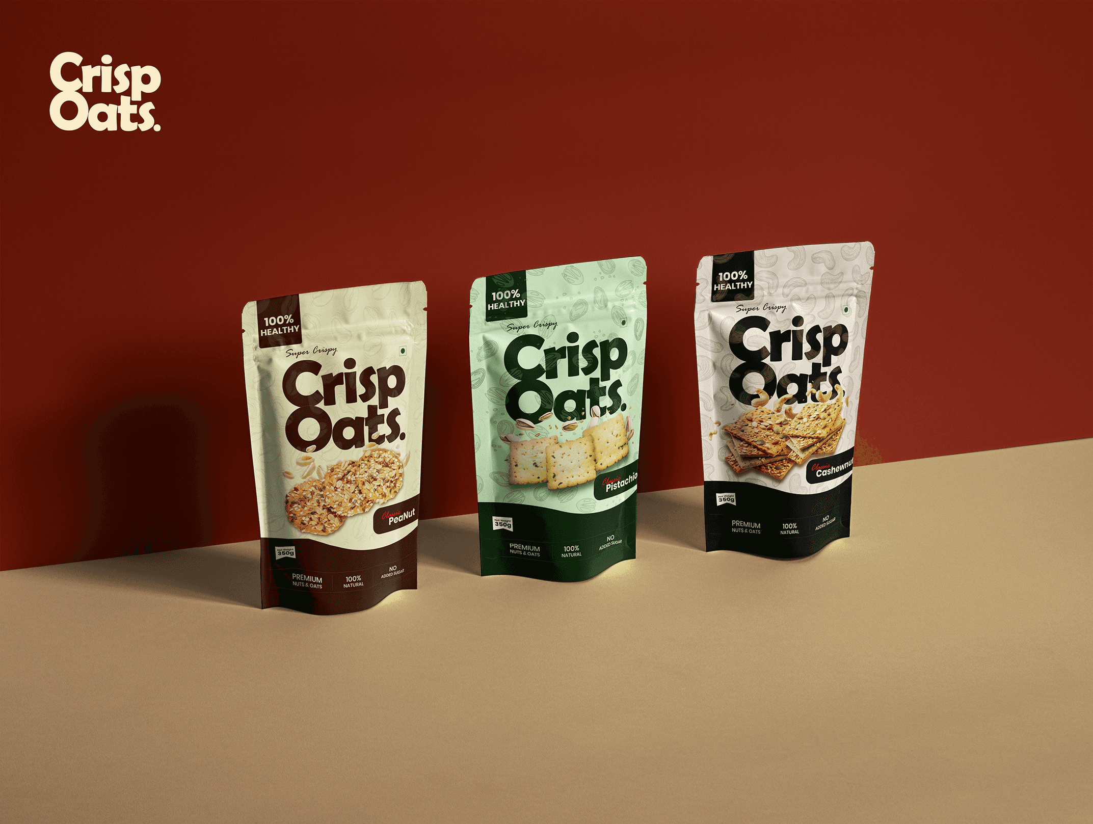
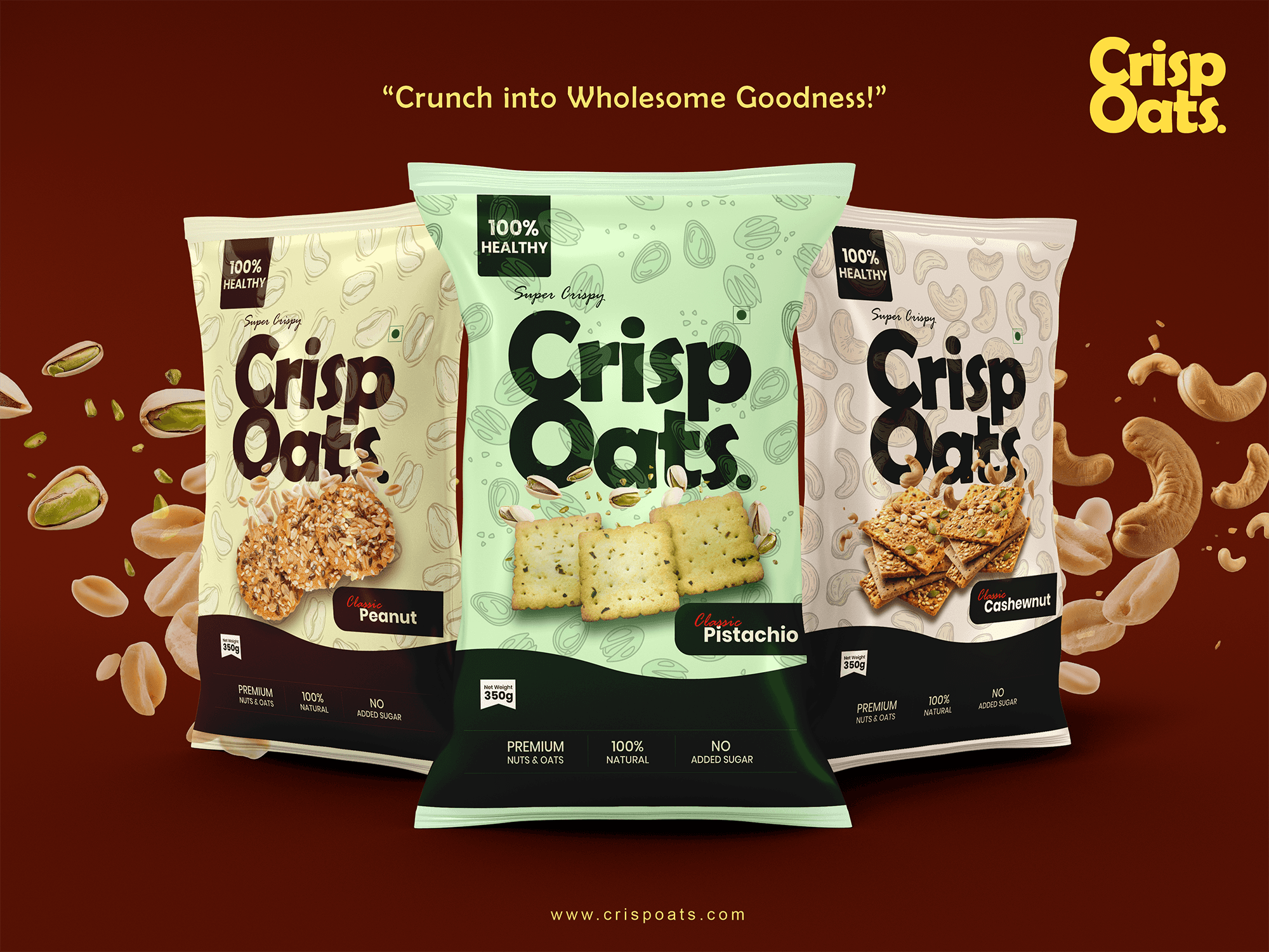
We developed a dynamic brand identity centred around punchy typography, energetic colours, and clean, confident packaging. Each flavour variant—Pistachio, Cashew, and Peanut—was given its own bold colour and personality, while maintaining a cohesive family look. Taglines like “Crunch into Wholesome Goodness” were crafted to reinforce the product’s USP and spark curiosity. We designed for versatility, ensuring the identity translated seamlessly across digital campaigns, print ads, billboards, and eCommerce packaging.


Development
Logo: Bold, friendly, and packed with character—designed to echo the crunch in every bite.
Packaging: High-contrast combinations with appetising visuals and clear benefit statements like “100% Healthy” and “No Added Sugar”.
Advertising: A clean typographic style combined with playful ingredient illustrations for billboards, airport panels, and retail displays.
Digital Assets: Custom social templates, animated product promos, and a vibrant UI prototype for online ordering.
Outcome
The final identity and packaging system delivered immediate impact. The updated look positioned Crisp Oats as a standout product on shelves and in digital campaigns, with each variant easily recognisable and aligned with its flavour profile. Early customer feedback praised the balance of aesthetic appeal and clear health messaging — a win for both branding and sales.